Product design
Case Study: Single Screen for Scalehouse Officers
Reducing fragmented attention without disrupting the realities of roadside enforcement
The problem
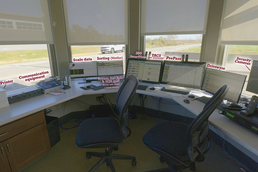
A scale house officer's attention is split between the weigh station roads, the scale, drivers at the desk, and a wall of monitors: axle weights, bridge formulas, DOT numbers, out-of-service warnings, site cameras. Limited staffing makes it worse.
Those systems come from different providers, use different interfaces, and aren't integrated. They aren't equally positioned or equally important, either. Tools like PrePass and 360SmartView often sit on monitors off to the side, feet away from where the officer is looking. Some are never even logged into.
What matters most to an officer is the world outside the window.
Even useful information has limited value if it isn't where the officer is already looking when a decision needs to be made.
The obvious answer was to combine the screens. Discovery showed us that wasn't enough. We also had to learn what deserves an officer's attention, what can realistically be integrated, how to tie data from different systems to the right vehicle, and how much change officers would actually accept.
That last question turned out to matter most.
Discovery: inside a working scalehouse
Screenshots couldn't explain this environment, so we went to operating sites. We watched where officers looked, which systems held their attention, and what happened when vehicles, alerts, and real-world events competed at once.
The fragmentation was physical as well as digital. Monitors had accumulated over time rather than being arranged around a single workflow. The scale was the primary focus, while cameras, PrePass, CVIEW, and other systems sat on screens around the room. Switching systems could even mean working out which mouse controlled which monitor.
Single Screen was a workspace and information-integration problem, not just a screen-design problem. The goal wasn't fewer monitors. It was less attention spent navigating the tools themselves.
"Important" depends on the officer
We expected research to reveal a clear information hierarchy. Instead, officers varied widely. Some leaned on safety scores; others trusted their own eye, recognizing companies or watching for particular violations. Weight mattered more at some sites than others.
What counted as important shifted with:
Who
Officer experience
Where
Site responsibilities
Capacity
Staffing
Mandate
Enforcement priorities
Load
Traffic conditions
Focus
What they're watching for that day
That pushed us away from one "perfect" dashboard and toward an experience that could adapt to different sites, workflows, and officers.
Familiarity is a user need
This finding challenged our instinct as designers to reinvent the interface. Many officers were comfortable with their workflow and wary of big changes. They kept coming back to simplicity, familiarity, and understanding things at a glance.
Simpler is better.
An officer, during field research
Every improvement we could imagine also risked adding unfamiliarity or cognitive effort. A technically better solution isn't a better experience if adopting it makes the job harder. So the goal became finding where meaningful improvements could land without disrupting familiar workflows, and evolving toward the cutting edge over time.
Exploring what Single Screen could be
We still explored deliberately forward-looking concepts. Rather than limiting ourselves to what we knew could be built, we asked: if we weren't constrained by today's interfaces, what would the ideal experience look like?

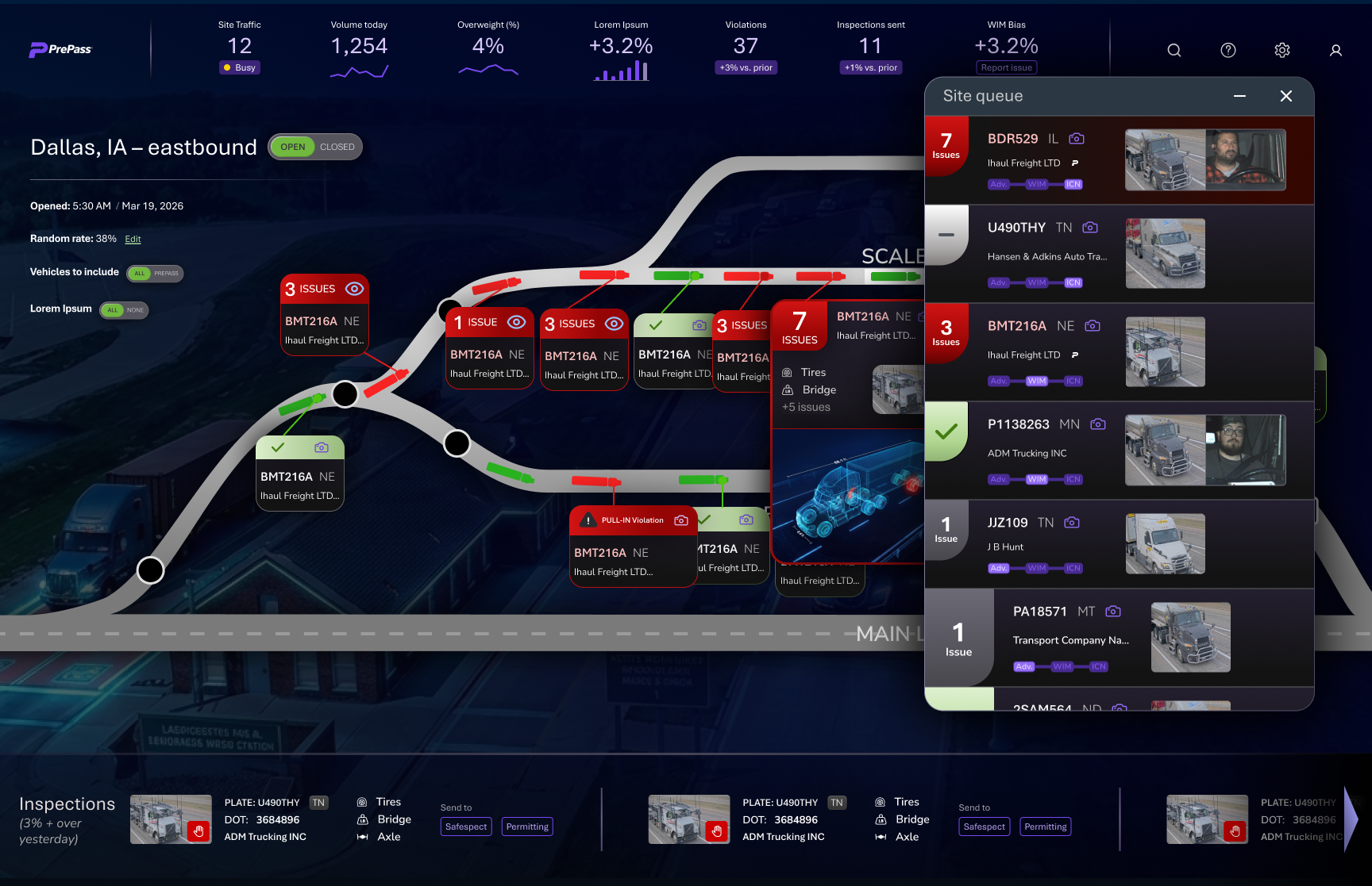
One direction showed a truck's journey through the weigh station: approaching, entering, bypassing, moving through. It exposed a problem beneath the interface. Before we could visualize a vehicle's journey, our systems had to reliably know which pieces of information belonged to the same physical truck.
Vision meets reality
This became one of the most valuable parts of the process. Every idea had to pass through five filters before it could become a specification, and our designs grew more grounded with every round.
Open each filter to see what it ruled out
01The best future experience
Where we started: highly integrated, contextual, forward-looking concepts, like visualizing a truck's whole journey through the site.
02What officers would adopt
Some ideas worked but added visual complexity officers didn't want. Others departed too far from workflows they already understood.
03What data we can reliably provide
Some concepts needed data that wasn't consistently available, or couldn't be confidently tied to a single vehicle.
04What current technology supports
Some ideas were simply too technically difficult for today's systems and APIs.
05What belongs in a first release
What survived became the foundation: bring key information together, integrate what lived on separate screens, and support decisions without radically changing how officers work.
The data problem under the interface
Vehicle images, alerts, screening information, and decisions are generated at different points in a vehicle's journey, often by different systems. Putting them all on one screen doesn't help if an officer can't trust that they belong together.
Single Screen needed to do more than aggregate information. It needed officers to trust that what they saw belonged to the vehicle in front of them.
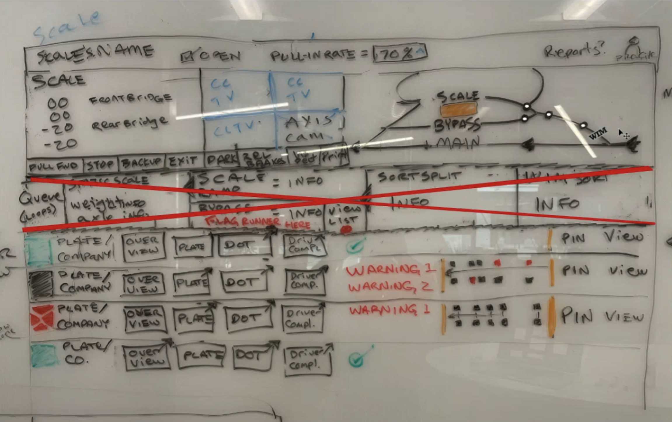
Technical discovery shaped the UX well into implementation. Bypass and screening decisions, for example, cover different parts of a vehicle's journey, so showing both clearly meant deciding how they're represented and separated in the underlying data, not just finding room for another field. Design wasn't handing engineering a finished screen. We were defining together what the product could meaningfully say, given the data that actually existed.
Designing for a glance
Officers rarely give an application their full attention. They're watching trucks, monitoring the scale, talking with drivers, and moving between workstations. A glance at the screen had to answer four questions:
01
What vehicle am I looking at?
02
Is something wrong?
03
Does this need my attention?
04
What does the driver need to do?
That became a better measure of success than how much we could fit on a screen.
The physical display mattered too. A larger consolidated monitor could block the officer's view through the scalehouse window, so screen size, height, sightlines, distance, and existing equipment were all part of the design. Single Screen had to fit the environment where the work happens.
Small wins inside the big vision
Research also surfaced improvements that didn't require solving the whole future state at once.
Video hidden — unlock to view
Pinning a vehicle. With trucks continually entering the system, a vehicle an officer cares about can scroll out of view. Pinning matches what officers already do: spot a truck, leave the desk to intercept the driver, come back to it later. It supports the workflow instead of changing it.
Alerts without alarm fatigue. If everything demands attention, nothing gets it. Officers helped us reframe the question:
Before
How do we notify officers?
After
What actually deserves to interrupt an officer?
Alerts became a hierarchy rather than another stream of information.
Where it stands
Single Screen is ongoing. We've narrowed a broad consolidation vision into a grounded first release that brings key vehicle and decision information together, integrates what used to live on separate screens, and supports officers' decisions without radically changing how they work.
Usability testing now focuses on whether officers can identify vehicles in heavy traffic, interpret screening and enforcement information, handle missing imagery, and tell when another system is still needed. Under all of it is one question: can an officer understand what matters quickly enough to act with confidence?
The more ambitious concepts are still valuable. They just don't all need to happen at once.
What I learned
The problem looked simple: scalehouses have too many screens, so combine them. But the real constraint was attention. Our products could hold valuable information and still be peripheral, simply because they weren't where the officer needed to look.
The challenge wasn't putting multiple systems onto one screen. It was earning one place in the officer's limited field of attention.
Innovation isn't only about how far forward you can push an interface. Often the harder problem is judging how far the user, the workflow, and the technology are ready to move together.
- Observe the complexity
- Learn where attention actually goes
- Explore the ideal
- Test it against real workflows
- Confront user and technical constraints
- Identify what genuinely matters
- Deliberately simplify
- Ship a foundation that can evolve