Product design
Case study: Enrollment upgrade
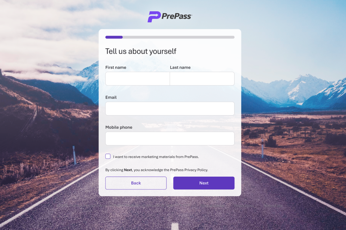
The problem
The legacy web enrollment path didn't enroll anyone.
Read that again – it's odd, right? After several steps of input, it simply captured an inquiry. The user waited for Sales to follow up by phone or email. This could take hours, days, sometimes weeks. And this was further dragged out by missed calls and paperwork delays.
The form made it all feel easy, but this hid the real customer journey. This was no simple sign-up! DOT records were checked. Documents were supplied. Safety scores were evaluated. Vehicle classes, device needs, payment, and service eligibility all had to be resolved. True enrollment completion depended on often tedious, manual, human processes.
A fast form isn't a fast enrollment if the customer waits days for a call-back to complete.
Bypass enrollment had long been considered too complicated for online self-service. Our data said otherwise: 98% of a 1,000-enrollment sample was adding 1–5 vehicles. These were owner/operators and microfleets. They didn't need a sales rep to get started.
Before
Submit an inquiry and wait
After
Create a working account in minutes, with an escape hatch to sales for the complicated cases
My role
I led the UX from discovery through launch and continued iteration. Discovery was an effort across all internal stakeholders. Product, engineering, operations, revenue, legal, marketing, and sales all contributed rules and reviewed tradeoffs. For external stakeholders (the customer) we studied feedback and recordings from sales calls to understand the stumbling blocks in the process. I worked across flow mapping, information architecture, interaction design, UX writing, prototyping, implementation review, research planning, analytics definition, and post-launch analysis. After launch, I used behavioral and operations data to evaluate the users' experience and identify next improvements.
This was far more than a visual redesign. The new path had to create accounts without a sales rep while keeping the validations, payment, account creation, and downstream D365 workflows intact. We had to choreograph multiple back-end steps between internal and external systems without disrupting the user, at just the right moment.
Discovery never stopped
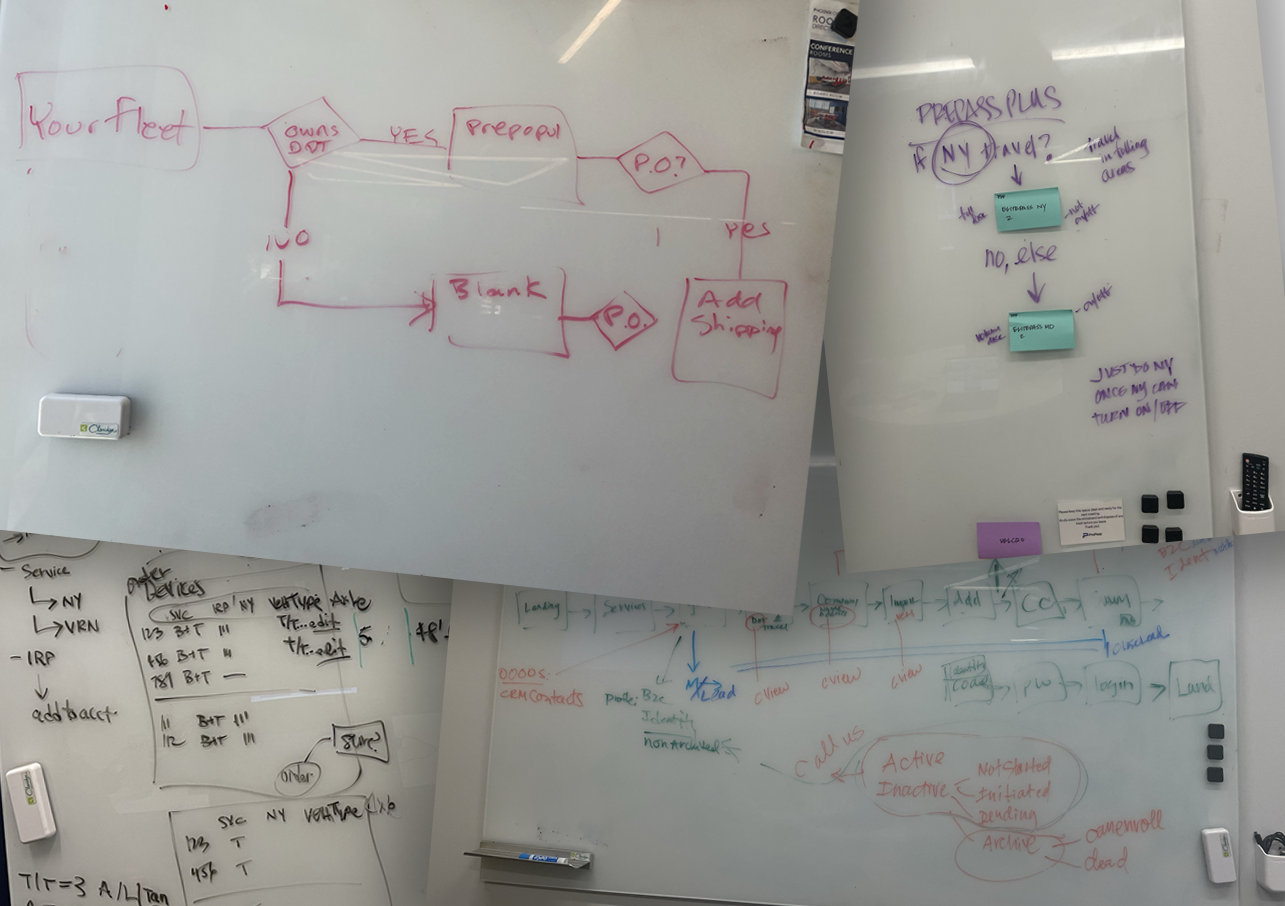
Discovery wasn't a single phase. It kept arriving from six directions:
01
Stakeholder reviews
02
Wireframes
03
Clickable prototypes
04
Implementation feedback
05
Analytics
06
Sales-call evidence
The business rules alone covered product combinations, payment authorization, shipping addresses, account creation, D365 lead updates, verification, and post-enrollment next steps. Legal and marketing reviewed every customer message.
The experience had to be "ruthlessly simple", while satisfying rules on identity, account, fleet, vehicles, payment, and operations.
From whiteboard to prototype
Early work started with conversations, whiteboards, and sometimes pieces of paper strewn across desks. Flow diagrams and wireframes set the sequence and scope. Once stakeholders felt we'd covered their concerns, and compromises were agreed upon, we moved to clickable prototypes for web and mobile. Often, the stakeholder reviews repeated as new findings were uncovered.
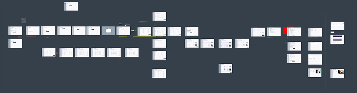
Those prototypes became the most complete description of how enrollment should behave, because they captured conditional states that static Zeplin exports couldn't. When a missing modal state caused rework during build, it proved the point.
Open each decision to see why it mattered
01Mobile first, web follows
For the first release, web followed the mobile sequence so customers met the same steps on every platform. We reviewed parity side by side rather than trusting it.
02Progressive detail
We explored moving vehicle detail after account creation, so the core enrollment stayed short for the owner/operators who make up most applicants.
03The prototype is the spec
Interaction states like editing and deleting a shipping address had to be visible to engineering. Prototypes, versioned alongside stories, became the source of truth.
04Guide existing customers out
Current customers were redirected away from new-customer enrollment. June reporting suggested this worked, though we treated it as a hypothesis.
05Prepare people before they start
A later iteration listed the documents people would need up front, kept separate from "you may already have an account" so new users weren't made to feel lost.
Measuring it honestly
The new web experience launched a randomized legacy-vs-self-service experiment, served to 20% of traffic for a specific product path, with legacy taking the remainder. Early results showed stronger lead and booking behavior, and a first round of quick changes to provide upsell opportunity for users who wanted to add onto their service choices. Stakeholders approved 50/50 after a month of evidence, coming from four places:
Mixpanel
Routing, steps, completions and funnel diagnosis
D365
Leads, opportunities, wins and account timing
Revenue workbook
MQLs, bookings, booked trucks and MRR
Manual review
Call summaries and notes on why people stalled
Early comparisons from sales enablement were misleading. Completed legacy "leads" were submitted forms by users interested in one of three different products. Most of the new flow's self-service leads were people who had stopped part-way on only the single product. I built an analysis in mixpanel and referenced the company CRM, focused on only traffic for the same specific product, deduplicated by email, targeting Won opportunities and the paths of those who did not.
Before
"Self-service converts less."
After
"Self-service captures more demand, books more customers, and exposes process issues we can now fix."
Outcomes
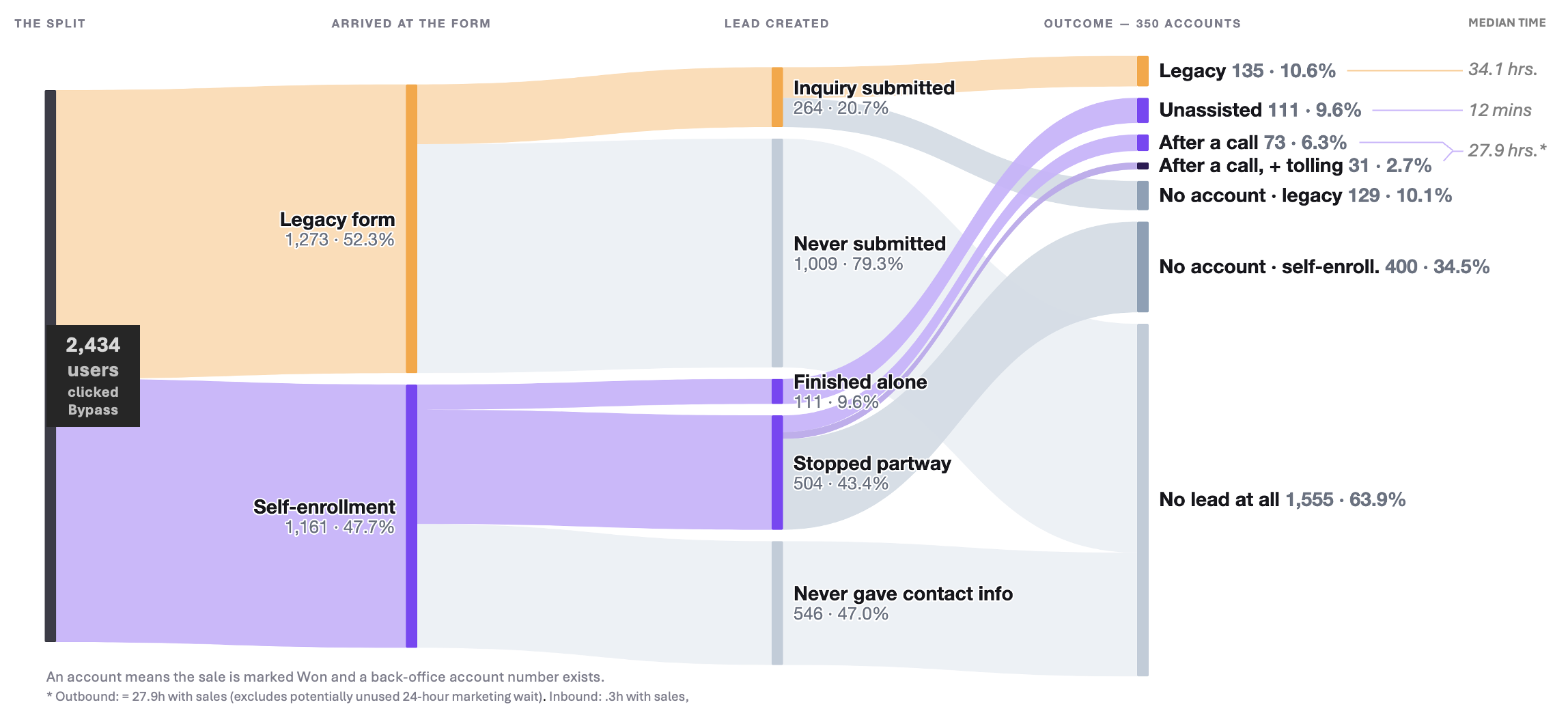
The surprising result wasn't just that self-service worked. Customers completing the entire enrollment themselves converted at nearly the same rate as legacy's much simpler inquiry form: roughly 9.8% vs. 10.6%, at a median of 12 minutes self-enrolling vs. 34.1 hours of time in the sales funnel.
But, we also proved another benefit.
When a customer abandoned legacy before submitting the inquiry, they disappeared. The new experience captured people earlier in the journey. This gives us a chance to understand where they stopped and, even to help them finish with sales outreach.
Self-service didn't just replace leads legacy had captured. It revealed demand that previously disappeared before Sales ever knew it existed.
When Sales helped recover those customers, the advantage became much clearer: 215 self-service-originated bookings versus 135 through legacy, covering 296 trucks versus 242. These are the outcome numbers already supported in your case-study evidence.
What launch revealed
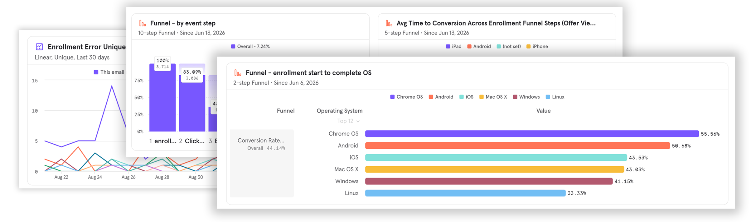
Once we removed the human from the process, we could truly see where the system itself was failing customers. A live person had been a buffer between the customer and our system's rougher edges.
Self-service removed that cushion. It was clear, where customers really stopped, where system rules trapped them, where records split or duplicated, and where a simple product journey collided with existing accounts, vehicles, and tolling needs.
Of several users recovered by sales, 27% hit a mechanical cause: software faults, existing-accounts, vehicles on another account, tolling needs the flow didn't cover. For over half, the record said nothing about why they stopped.
| Where people stopped | Users | Recovered by sales |
|---|---|---|
| Create password | 170 | 28 |
| About yourself | 128 | 15 |
| Review enrollment | 112 | Not stated |
| Company details | 85 | 22 |
| About your fleet | 73 | 16 |
That turned into the next round of work:
- Route detected existing accounts to sign-in or recovery instead of a dead end.
- Let people resolve a vehicle still tied to a previous employer or account.
- Rethink password and identity sequencing, the biggest single stop.
- Expand to tolling service without destroying the efficiency we proved.
- Record why people abandon, so we don't depend on reading call notes.
An evolving journey
Launch didn't close the project. It did change the questions we could ask.
We are now using real enrollment behavior, CRM outcomes and sales-assist cases to remove the remaining breaks between self-service and human help. That includes recognizing existing enrollment leads instead of creating duplicates, recovering customers instead of restarting them, improving error visibility and analytics, handling fleet sizes beyond the primary self-service audience, and expanding into Tolling without re-introducing complexity to the user that we'd intentionally removed.
The latest experiment produced enough evidence for the business to recommend moving 100% of Bypass-only traffic to self-enrollment once the remaining operational concerns are addressed – our next step, alongside ongoing improvements toward desired outcomes, and even better questions to ask.
Learnings
It may have seemed like a simple form redesign. But this was a complex system of business rules that had to be navigated: rules, records, handoffs, and data definitions, everything shaping how and if a customer could finish. Different selections led to different permutations of user experience and product configuration.
I didn't simply redesign enrollment. I helped redesign the system around it: what customers could do themselves, where people should step in, how we measure success, and how evidence feeds the next iteration.