Design systems
Design system, part 2: Modernizing with Agentic Development
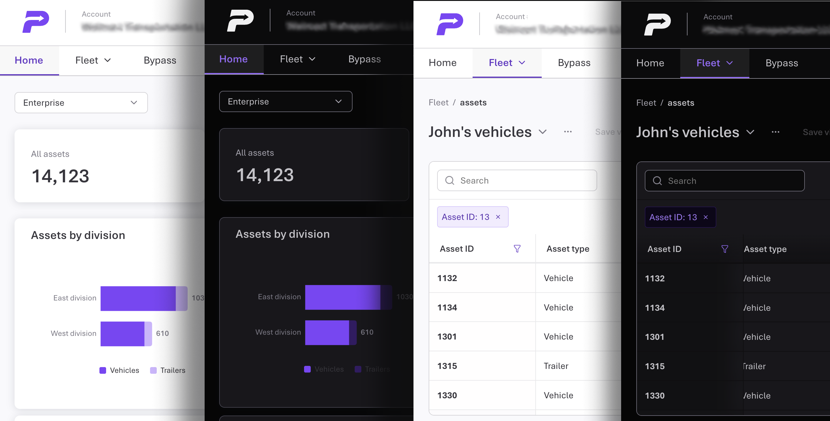
Part 2: Modernizing the Design System with Agentic Development
Overview
The Figma-first library gave PrePass teams a shared language. But in the product customers actually used, the experience was still inconsistent and, in places, inaccessible. The design intent wasn't reaching the screen, and security and code quality had been left to individual engineers. I led the modernization using AI agents as my design-engineering team: I set the UX standard and made the design decisions; the agents built, tested and verified against it.
By the numbers
| 2.68:1 → 4.81:1 | White text on success-green status fills, now above the 4.5:1 minimum |
| 4.00:1 → 5.89:1 | White text on danger buttons at hover, the one state that failed |
| ~2,200 | Automated unit and accessibility tests on every change |
| ~140 | Public components and exports, held to one standard |
| 25 | Broken style classes the linter found on its first run in one product feature, all rendering nothing |
| 567 / 725 | Legacy component styles mapped to design roles / legacy color wrappers converted, none unresolved |
| 4 | Independent security reviews; every high- and medium-priority finding fixed |
| 0 | Runtime dependencies |
Users' experience
I audited our customer-facing site, and the previous iteration of its replacement, against the design system:
- The same action looked different from screen to screen. Roughly 210 hand-built buttons and 1,300+ inline styles, against about 30 uses of the shared library.
- Some labels were hard to read. White text on success-green status fills measured 2.68:1.
- Tables hid information. Nothing told a fleet manager more columns sat off-screen.
- Keyboard and assistive-technology users hit dead ends. Focus rings vanished in Windows High Contrast; some form errors were shown only in color.
- Specs drifted silently. One team hand-copied our form guidelines because they couldn't install the package.
Consistency depended on someone noticing the problem. Inefficient!
My role: UX lead directing an agentic team
| Role | Responsibility |
|---|---|
| Me (UX lead and owner) | Set the standard, research patterns, make every design decision, approve releases |
| Authoring agent | Builds components, tokens, docs and tests to my specifications |
| Review agent | Tests the work in a real browser and reports problems with evidence and a proposed fix |
No agent signed off its own work. Any claims, be it 'accessible', 'secure' or otherwise, had to be shown working in a browser before they reached me.
I required three principles to guide every round of changes:
- The coded system was to be the standard; Figma was the starting point. What we were making could (and did) surpass the original designs.
- Any usability or accessibility defect gets fixed even if no customer has reported it.
- **WCAG 2.1 was a guiding principle in anything we created, to comply with our obligations to new state government requirements.
UX decisions made
There were numerous improvements and changes as we encountered issues and opportunities. A few below:
- Status colors. A mid-tone success green and a brighter danger red so white labels pass in every state, plus a separate, darker color for error text on tinted backgrounds.
- Tables that show there's more. This product is data-dense, and we had to accommodate. Edge fades mark hidden columns, and the scroll area is reachable from the keyboard. Header labels now use the full column until sort and filter icons appear, and numeric headers align with their numbers.
- Scrollbars. I rolled out styled scrollbars, then we reversed it: on macOS they replaced those subtle overlay bars with permanent bars that crowded our dense tables. Our tables already signaled overflow, so native bars were a better experience. Apps can still opt in.
- Multi-value entry. Fleet users work in lists: unit numbers, VINs, plates, states. I specified a tag input that turns typed or pasted values, including a spreadsheet column, into removable chips; explains each rejected value in words, with Edit and Dismiss, so a pasted value doesn't get silently lost. It works fully from a keyboard or screen reader. Type-ahead suggestions followed, benchmarked against the WAI-ARIA combobox pattern and MUI, Adobe Spectrum, IBM Carbon and Atlassian.
- Notifications. Toasts appear one at a time in priority order, stay at least 5 seconds, and pause on hover or focus.
- Control geometry. Buttons now match field heights so toolbars line up, and corner radius follows height, so a control nested in a card appears to 'fit' – those little things that make a cohesive experience.
- micro-animations I leveraged a small bounce on modals and popovers to tie in with the 'movement' theme of our brand, and pull attention where we needed in the midst of dense data.
Turning principles into guardrails
Guidance alone had not been enough in the first Design System, so every rule that mattered to users was checked through tests (and deterministically where possible):
- Accessibility: automated scans and keyboard tests on every component; browser checks of contrast in light and dark themes and of high-contrast mode.
- Visual consistency: screenshot comparison on every change, so an unintended visual shift fails the build.
- No drift in consuming apps: a linter product teams run in their own pipelines flags off-palette colors, off-scale spacing and type, and undefined style classes.
- Named roles, not raw colors: components use roles like "action" and "danger text," so a rebrand or accessibility fix changes one value everywhere.
- Gradual migration: a compatibility layer lets the existing app adopt the new visual language without a disruptive cut-over.
Security and clean code from the start
Component inputs like links, alert text and table values often come straight from an API, so the system treats them as potentially hostile:
- Every link is checked, so a
javascript:URL can't run code. - Raw HTML is never rendered.
- Displayed text is stripped of hidden direction-reversing characters that could disguise, say, a file name.
- New-window links carry
noopener noreferrer. - Saved table layouts are validated before they're restored.
Four reviews produced 35+ findings; the latest found no critical issues and no stored cross-site scripting.
On code quality, size budgets, banned heavy imports, linting and type-checking all block a release. Large tables render only visible rows, and simplification passes consolidate duplicate logic.
Understanding real behavior, safely
Components report meaningful interactions through a typed plan of 21 events, such as a table sorted or filtered, a flow step completed or abandoned, or a dialog dismissed and how. The system only emits them; each app decides what to send. Passwords and free text are never captured, and on-screen customer data is marked so session-replay tools mask it.
Catching problems before customers do
The review agent tests every change in a real browser, not just the ones it was asked about. In one release it caught:
- A type-ahead answering the previous search, rejecting a valid state typed at normal speed.
- A keyboard highlight at 1.06:1 contrast across four dropdowns, brought to me as a design decision with options rather than fixed silently.
- Missing privacy markers on new suggestion rows.
None reached a customer.
Outcome
- Adoption at last 2 of 5 product teams have adopted, with three coming onboard in coming weeks.
- One experience across products: patterns, states and feedback behave the same everywhere.
- Accessibility verified, not assumed: WCAG 2.1 AA checked on every component and release.
- Drift caught by the system: visual changes, palette violations and broken styles fail a build.
- A clear path for product teams: a linter, a migration guide and a compatibility layer, not just a style guide.
Learnings
- Agents amplify UX leadership; they don't replace it. They produced options and evidence fast; the judgment stayed with me.
- Principles held only if checked. Agents are force multipliers, but true quality control required deterministic evaluation.
- Verify where users are. Real browsers, themes and assistive-technology output caught what reading code missed.
- Design systems are still organizational products. Standards, stakeholders, governance and ownership decide adoption.