Product design
Case study: Making 524k plants findable by two incompatible user personas
One search box for a curious gardener and a working botanist, without dumbing down the science
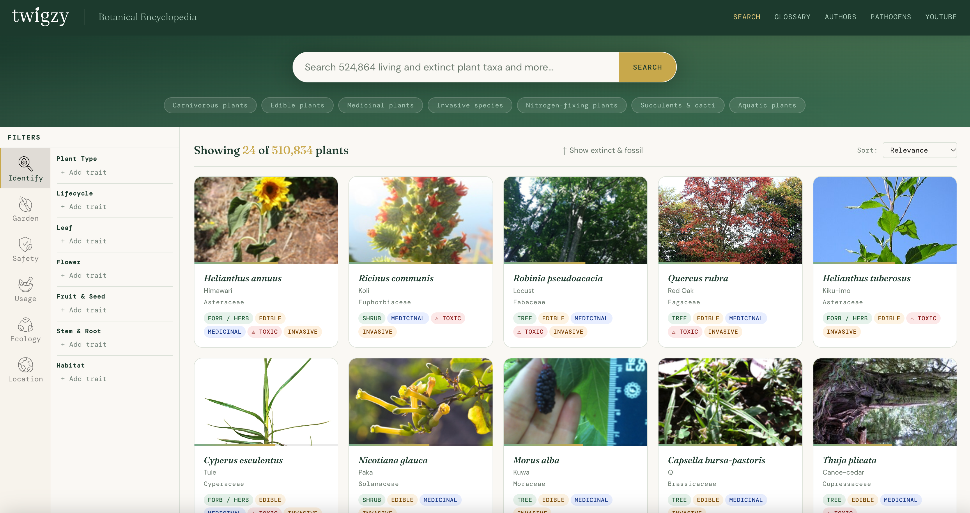
The problem
Twigzy is a plant encyclopedia covering more than half a million plants, including 13,584 known only as fossils, each searchable by up to 115 characteristics. Two very different people share the same search box:
| The curious novice | The expert | |
|---|---|---|
| Arrives with | A leaf, a common name, a worry | A precise trait, a scientific name, a need to cite |
| Speaks | "pointy leaves", "that purple bush" | acuminate, Ambrosia artemisiifolia |
| Wants | A confident answer, fast | Every match, with sources intact |
| Gives up when | Faced with 115 fields of jargon | Given a tidied-up answer that hides who said what |
Most tools pick one. Twigzy had to serve both from the same records, under one rule: simplify the presentation, never the data.
Twigzy is pre-launch, and studies with both groups come next. Until then, the design leans on botanical field guides for structure, the data itself for honesty, and a log of every defect I found. I'll update this page as results come in.
Tasks first
Inside each task, filters open in Miller columns, like Finder's column view: task, category, trait, values. Your path stays visible, and back is one click. A Simple / Advanced switch shows "toothed" to the novice and the finer botanical terms to the expert.
Pictures, not photos
Photo-ID apps look like the easiest answer, but they struggle. In one study, even the best app got more than one in ten plants wrong, and every app did worse on leaves alone. The plants are part of the problem: leaves on a single tree can vary widely, and close relatives can look identical. A camera sees one leaf, but a botanist reads the range.
So Twigzy asks you to choose instead. More than 100 illustrations cover leaf shapes, edges, tips, bases and more, each with a plain caption like "lance-shaped, widest below the middle." You pick what matches the leaf in your hand and learn the word along the way. The expert just reads the term.
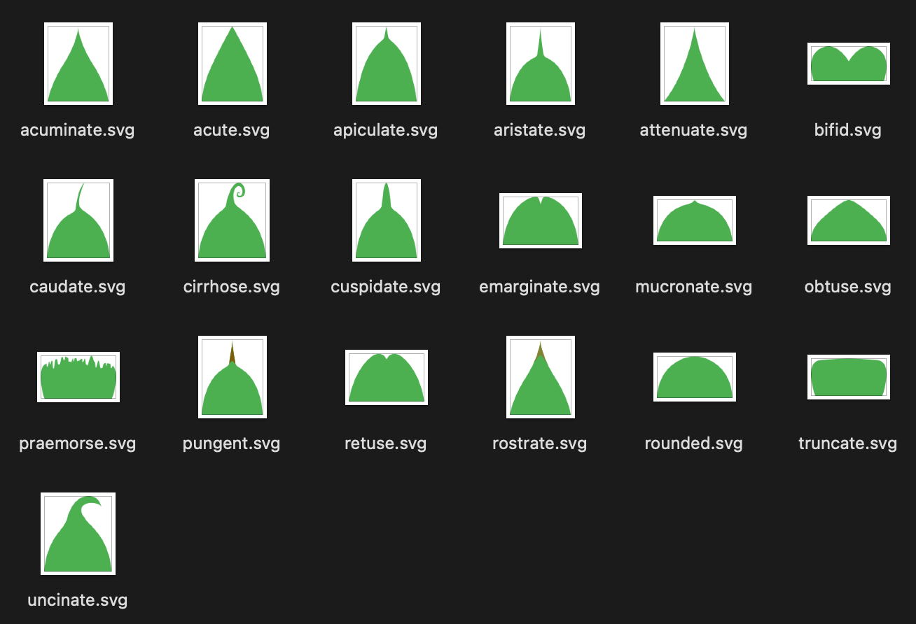
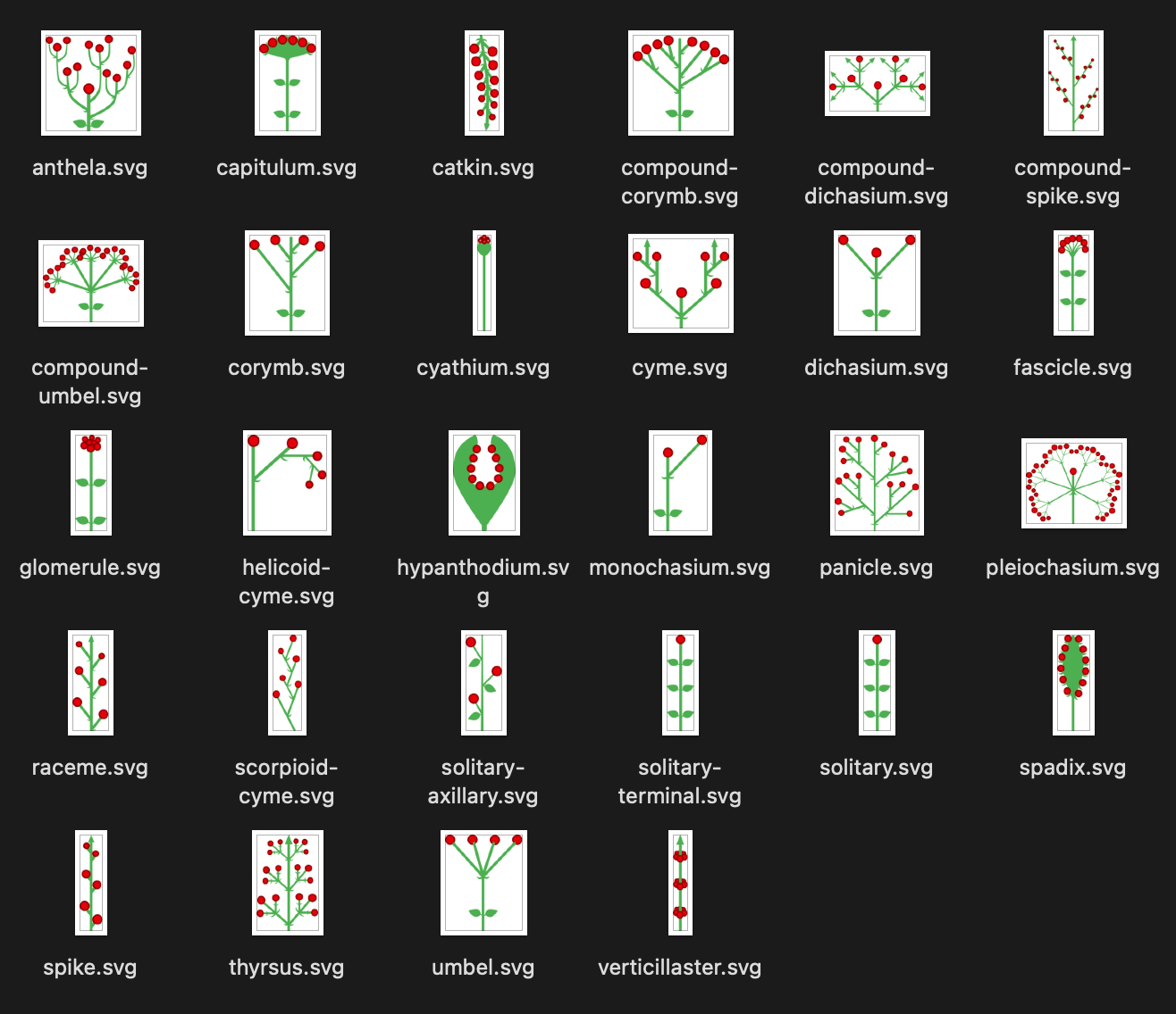
Every trait is also multiple choice, because plants rarely have one answer. Sassafras grows three leaf shapes on the same tree, and you may honestly not know whether yours is oval or lance-shaped. So pick both. The preview draws all your picks together, and the filter chips carry small versions of each shape.
Plain-language search
Type a name and it searches names. Type a phrase like "plants toxic to cats" and it works out which filters you mean. Simple rules catch common phrasings, and an AI model handles the rest, so "good for bees" and "attracts pollinators" land on the same filter.
The AI only understands the question. It never writes an answer or picks a "right" plant, so every result still traces back to a source. Each filter it chose appears as a chip you can remove, and if a search returns nothing, it tells you which filter caused it.
I ruled out a chatbot: the source text is too uneven in a world that has grown distrustful of A.I. — and it would cost around $540 a month for a site that has to run for free.
Common names
"Orange" used to return 8 obscure plants and no citrus. Now it returns 467, with Citrus first. But 64,013 common names belong to more than one species, so every match comes back with its scientific name beside the common one. The novice recognizes what they typed, and the expert reads the name that's unambiguous.
Honest gaps
- Unknown isn't "no." "Not known to be toxic" and "known not to be toxic" are different claims, by different literature. The interface keeps them apart. We score results based on quantity of answers.
- Coverage is shown. Each task tells you how many of the 524,864 species it actually has data for.
- Disagreements stay visible. When sources conflict, the plant shows up under every claimed value.
- Searches are shareable. Every search lives in its URL, so a scientist can cite it.
Testing
Before putting it in front of people, I checked what the interface claimed against what the data held. That's where nearly every major fix came from:
- Picking one filter value hid all the others, breaking multiple choice in 69 of 95 filters.
- Plants with several values could be found under only the first one.
- 510 meaningless values showed up as clickable options.
None of this was visible on screen. A filter list looks fine even when it's wrong, so several of these checks are now automated tests.
What's next
Two small studies, one with each group, since they fail in different ways. Open questions I'll be watching:
- Does someone asking "is this edible?" look under Safety or Uses?
- Should Advanced mode remember experts between pickers?
- Counts can add up to more than the total, because one plant can sit under several values. That's correct, but it will look like a bug.
Learnings
A picture lowers the bar without lowering the standard. Novices can choose like experts without the vocabulary, and experts lose nothing.
In data-heavy products, honesty is design work. My biggest defects weren't visual. They were filters saying untrue things.
The next step is people. The data tells me what the interface can claim. The studies will tell me whether it matches how people think.
References
- Campbell, N., Bacon, K. & Peacock, J. (2023). A repeatable scoring system for assessing smartphone applications' ability to identify herbaceous plants. PLOS ONE. Summary: University of Leeds
- An analysis of the accuracy of photo-based plant identification applications on fifty-five tree species (2022). Arboriculture & Urban Forestry, 48(1), 27. auf.isa-arbor.com
- Pankau, R. (2022, January 21). How accurate are photo-based plant identification apps? The Garden Scoop, University of Illinois Extension. extension.illinois.edu
- Problems with computer vision and new, inexperienced users. iNaturalist Community Forum. forum.inaturalist.org