Design systems
Building a Scalable Design System for a fragmented Multi-Team Enterprise Platform
 # Building a Design System for a Fragmented, Multi-Team Platform
Overview
PrePass product teams were building interfaces on their own, with no design system, no shared guidance and no component library. The result was inconsistent UI, duplicated engineering work and a disjointed experience for customers moving between products. I started the effort to fix this and led it, doing most of the research and design myself, to give every team one shared foundation.
The problem
As PrePass grew into enrollment, tolling, fleet management, site officer tools and analytics, each team built its own version of the same UI. We had:
- Several visual styles across products and platforms
- Duplicated components, including five different dropdown patterns
- Inconsistent tables, the core surface of most of our products
- No path from design to code, and no governance over UI changes
- Scattered or missing documentation
For users, that meant more to learn every time they changed product. For the business, it meant paying to design and build the same thing several times.
Research and audit
Before designing anything, we took stock of what already existed. We:
- audited the components already in production;
- catalogued layout and interaction patterns across products;
- interviewed engineers;
- reviewed support tickets;
- mapped where designs and code had drifted apart.
The audit became the basis for the "Unified Web Experience" working documents. We treated it as a living discussion, not a one-off deliverable.
Principles
We set guardrails rather than a visual style:
- Predictable interactions: the same pattern behaves the same way everywhere.
- Design maps directly to code: designers and engineers shouldn't have to translate between them.
- Consistency without blocking product needs.
- Accessibility as the baseline, not a later enhancement.
- Teams can adopt in phases, without a big-bang migration.
These went into living UX guidance covering typography, spacing, layout, colour, patterns and interaction states.
System architecture
We defined how the system works, not just how it looks. It has three layers:
- Design tokens: colour, spacing, type, radius. These are tool-agnostic, so they aren't tied to any framework.
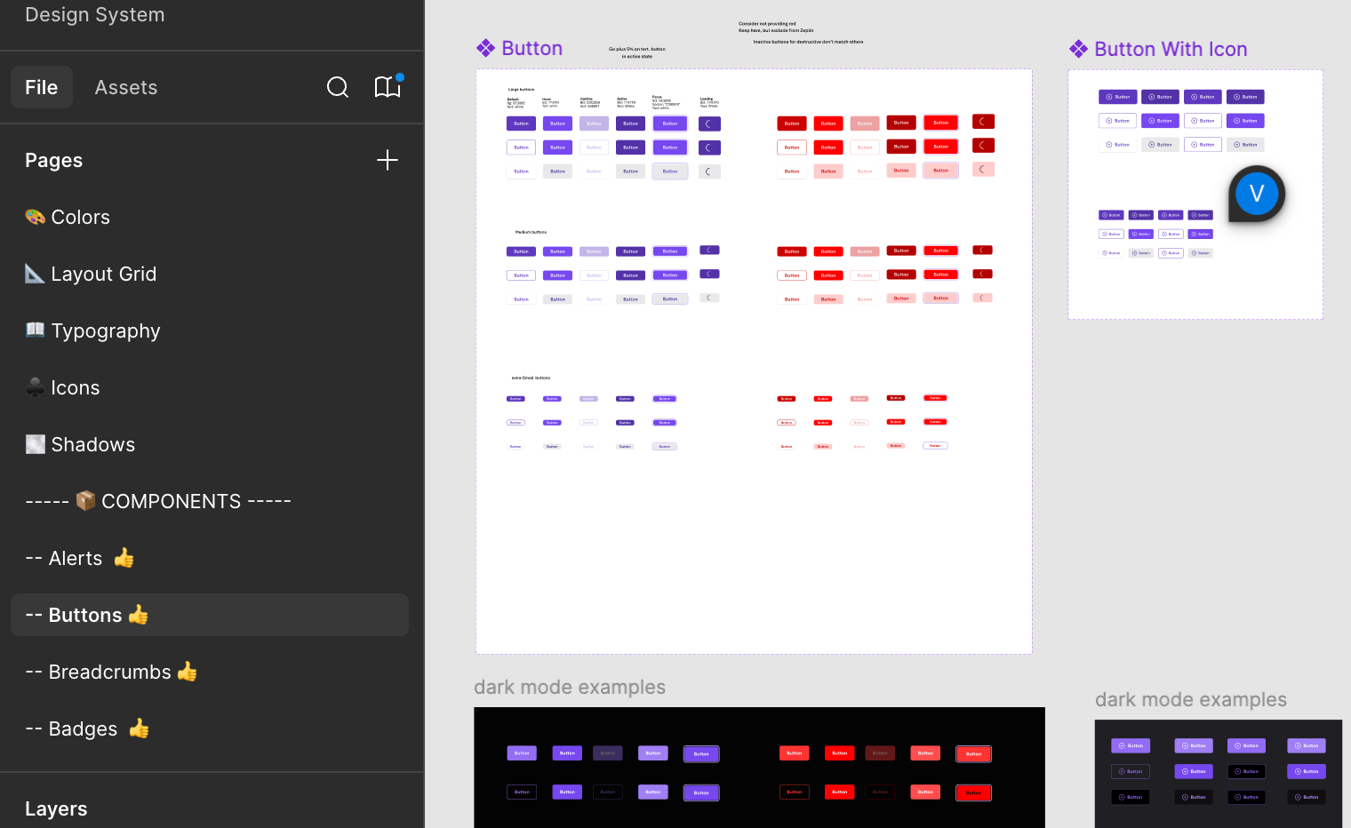
- Base components: buttons, inputs, selects.
- Composed components: tables, vehicle cards, dashboard panels.
A change at one layer doesn't ripple into the others. Tokens can change, for a rebrand or an accessibility fix, while base components stay predictable. That lets product teams move fast without fragmenting the system again. UX and engineering defined the naming conventions, variants, layout rules and token lifecycle (including deprecation) together.
From design to code
The Figma library was the authoritative design source, built with production in mind: variants, states, spacing and behaviour were defined up front. From there, each component followed one handoff path:
Figma → Zeplin (specs and tokens) → Confluence (usage guidance) → Storybook (built and validated in code) → Product teams
Storybook became where UX and engineering met. We validated components in real code there and checked them against Figma and Zeplin, so gaps showed up early instead of in production.
Documentation
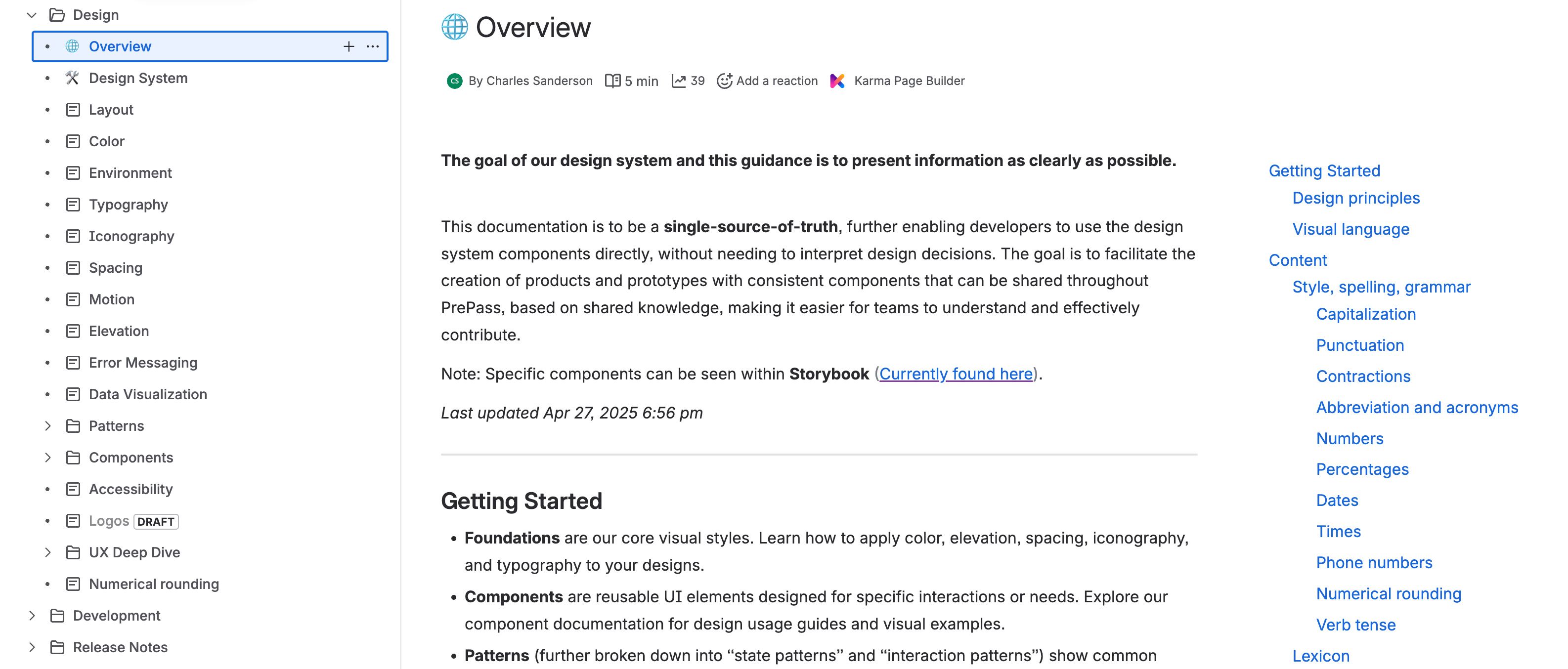 Components alone weren't enough: teams needed to know when and how to use them. I made documentation a core part of the system, and UX and engineering owned it together:
- Confluence explained the why and when: intent, rules and decisions in plain language.
- Storybook showed the what and how: real states, variants and edge cases.
Governance
Changes followed one path:
Proposal → design system review → prototype and test → add to library → Storybook → documentation
Adoption
The first product team piloted the library. Some of its engineers had helped build the components, which made the pilot easier. Contribution and review processes were being set up for wider rollout.
Learnings
- A design system is an organizational product, not a component library. It needs governance, documentation and owners.
- Engineers have to be involved from the start. Parity is designed in, not checked at the end.
- Documentation decides adoption. Teams use what they understand.
- Scope has to stay controlled. A focused system that ships beats a complete one that doesn't.
The pilot also showed the limits of this foundation. That is the subject of Part 2.