UI Spacing: A practical guide
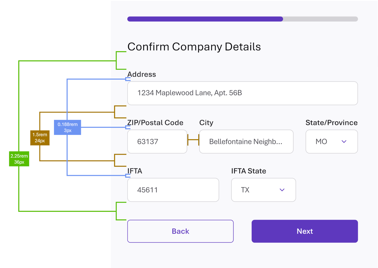
UI Spacing: A Practical Guide to Spacing Systems, Whitespace, and Visual Hierarchy
Spacing is one of the simplest tools a designer has for creating hierarchy, communicating relationships, and making interfaces easier to understand.
In UI and web design, spacing is the empty area between and around elements. It can be created with CSS properties such as margin, padding, and gap, but good spacing is more than just choosing pixel values. A well-designed spacing system gives your product a consistent visual language while still allowing layouts to adapt to different content and screen sizes.
Why spacing matters in UI design
Users don't perceive isolated objects on a page. They interpret relationships between elements. In fact, Spacing tells our brain what belongs together before we've even consciously interpreted the content.
A dense interface isn't necessarily a bad thing. The problem is unstructured density. And proper spacing lowers cognitive load. A 2023 study on visual crowding and reading examined how spacing between letters and lines affects eye movements during natural reading. Researchers found that spacing affects processes including "parafoveal processing" and "saccade behavior"; essentially wider line spacing produced measurable changes in fixation and reading behavior. Source
Elements that are close together tend to be perceived as related. Increasing the space between elements creates separation, often signaling that they belong to different groups.
So simple a concept, yet the resulting 'spacial grammer' is an extremely powerful tool for communicating:
- Grouping: Keep related information visually together.
- Hierarchy: Use larger spaces to separate major sections from supporting content.
- Order: Consistent spacing patterns make interfaces easier to scan.
- Emphasis: Additional space can draw attention to an important element.
- Rhythm: Repeated spacing values create visual consistency and predictability.
- Rest: Whitespace gives dense interfaces room to breathe.
Spacing therefore shouldn't be treated as decoration added after a layout is complete. It is part of the information architecture of the interface.
Build a spacing system, not a collection of arbitrary values
There is evidence for relationships between spacing levels, but I don't think the research supports a universal formula like “heading spacing = 2.0 × line height, section spacing = 4.0 × line height.” What does exist is a concept of vertical rhythm or typographic rhythm. The exact values aren't scientifically universal. What's important is the hierarchy of ratios: making the spatial differences between gaps proportional to the differences in meaning.
A spacing system is a limited set of reusable values that designers and developers use throughout a product. Consistency is key
Instead of choosing a different value every time something needs more or less room, a spacing scale might contain values such as:
4 · 8 · 12 · 16 · 24 · 32 · 48 · 64
The exact values aren't universal. What matters most is that the system is:
- predictable
- easy to understand
- flexible enough for different layouts
- consistently applied
- compatible with the typography and components in the product
A defined spacing scale also makes design decisions easier to communicate between designers and developers.
Choosing a spacing system
There is no single spacing unit that every design system uses. Common approaches include 4px and 8px foundations, while some systems use 6px or combine several increments in a more granular scale.
The choice of base unit affects how much flexibility a spacing system provides. For example:
6px vs. 8px
An common 8px foundation creates a simple progression:
8 · 16 · 24 · 32 · 40 · 48 · 56 · 64
A 6px foundation provides smaller increments:
6 · 12 · 18 · 24 · 30 · 36 · 42 · 48 · 54 · 60 · 66 · 72
The advantage of 6px is greater granularity. It divides cleanly into halves and thirds, which can be useful when designing layouts with columns, typography, or components that benefit from intermediate values.
The advantage of 8px is simplicity and familiarity. It is a widely used foundation in digital design systems, and many established systems build their spacing tokens around it.
Neither approach is inherently better. The right choice depends on the needs of the product and the level of flexibility the design system requires.
It's also worth distinguishing a base unit from a spacing scale. A system may use an 8px foundation while still including 6px, 12px, or other values when those values serve a specific purpose.
The goal is not to force every measurement to conform to a mathematical rule. It is to create a predictable vocabulary of spacing that supports consistent design decisions.
Use smaller spacing for stronger relationships
A useful way to think about a spacing scale is in terms of relationships rather than individual pixel values.
Tight spacing
Use smaller values when elements are closely related.
Examples include:
- an icon and its label
- a form label and its input
- text within a compact control
- items within a small component
- badges and their associated content
Moderate spacing
Use more space when separating related groups of content.
Examples include:
- form fields
- cards within a group
- headings and their supporting content
- sections within a component
- groups of controls
Large spacing
Use larger values when creating meaningful separation between major areas.
Examples include:
- page sections
- major content groups
- content and the edge of a page
- sections of a landing page
- major changes in information hierarchy
The principle is simple: the more important the separation, the more space you generally need.
Whitespace and visual hierarchy
Whitespace — sometimes called white space — is not wasted space.
A page can contain all the necessary information and still feel difficult to use if everything is packed together. Strategic whitespace separates groups, establishes hierarchy, and gives the user's eyes places to rest.
This is particularly important in dense interfaces such as dashboards, tables, and forms. A component may intentionally be dense because users need to see a lot of information at once. That doesn't mean the entire page should be equally dense.
A useful distinction is:
Dense components can exist within a spacious layout.
The goal isn't to maximize whitespace. The goal is to use space intentionally.
Spacing and visual hierarchy
Spacing should reinforce the hierarchy of the content.
For example, a heading might have:
- relatively little space between the heading and the content it introduces
- substantially more space between that content and the next section
This creates a visual connection between the heading and its content while separating that group from the next one.
When every relationship uses the same amount of space, hierarchy becomes harder to perceive.
Do not make every measurement exact
A spacing system should provide guidance, not eliminate judgment.
Content doesn't always behave predictably. A heading may wrap to two lines. A card may contain more information than expected. A control may have unusual visual weight. Two elements with mathematically identical dimensions may not appear optically identical.
Small adjustments can therefore be appropriate when they improve visual balance.
The goal is consistency of relationships, not mathematical perfection.
Spacing in responsive layouts
Spacing should work across the range of devices and viewport sizes your users actually use.
Rather than designing around a collection of presumed screen sizes, consider how the layout behaves as available space changes.
Responsive and fluid techniques can be combined to achieve this. Some spacing may remain fixed while other dimensions expand or contract with the available space.
For example:
- component-level spacing may use consistent design-token values
- page margins may adapt to viewport width
- content containers may have maximum widths
- larger sections may use fluid spacing when appropriate
The important question isn't "What spacing should this desktop screen have?" It is "How should this relationship behave as the available space changes?"
Practical spacing guidelines
There is no universal spacing scale that works for every product, but the following ranges are useful starting points:
Small — approximately 4–12px
Tight relationships such as labels, icons, controls, badges, and compact table content.
Medium — approximately 16–32px
Relationships between related pieces of content, form fields, cards, and component sections.
Large — approximately 40–72px and beyond
Major sections, page-level relationships, and significant changes in hierarchy.
These are starting points rather than rules. Typography, component size, content density, and platform should all influence the final decision.
Spacing and accessibility
Spacing can affect accessibility as well as visual hierarchy.
Text needs enough line height and separation to remain readable, while interactive elements need enough space to be distinguishable and usable.
For body text, a line height around 1.5 times the font size is a useful readability starting point. WCAG 2.2's Text Spacing criterion also requires content to remain usable when users apply increased text spacing, including a line height of at least 1.5 times the font size and additional paragraph, letter, and word spacing.
Accessibility should therefore be considered when establishing spacing tokens and component layouts rather than treated as a final adjustment.
A simple way to evaluate spacing
When reviewing a layout, ask:
What belongs together?
Elements that are conceptually related should generally have less space between them.What belongs apart?
Increase space when moving between distinct groups or levels of hierarchy.Is the hierarchy obvious without borders?
Good spacing can often communicate grouping without requiring additional lines, containers, or decoration.Is the page too dense?
Look for opportunities to create visual resting points.Is the spacing system being used consistently?
Repeated relationships should generally use repeated spacing values.Does it still work at different viewport sizes?
Test the layout with real content and across the devices your users rely on.Does it look balanced, not just mathematically correct?
Optical adjustments are sometimes necessary.
The goal isn't more whitespace. It's better relationships.
A successful spacing system doesn't make every interface look identical. It gives designers a shared vocabulary for expressing relationships between elements.
Use smaller spaces to reinforce relationships, larger spaces to create separation, and a limited set of predictable values to establish consistency. Then allow content, hierarchy, accessibility, and optical balance to determine when an exception is appropriate.
Good spacing is ultimately invisible when it works: users aren't thinking about the pixels. They're simply able to understand the interface more easily.
Further reading:
https://www.researchgate.net/publication/254871166_Designing_instructional_and_informational_text
https://www.journals.uc.edu/index.php/vl/article/view/5533