It is said that a logo is the most quarter inch in business. It needs to convey identity in a heartbeat, and function successfully in numerous scenarios. Is it legible when tiny? Does it work on projection. Is there a greyscale version. Do you have a logo mark? It's never as simple just making a company's name look nice.
For the Privacy Xchange Forum's 5th Anniversary, a refresh was in order. I created something more impactful, to match the event's desire to be a strong voice in the Cybersecurity community.
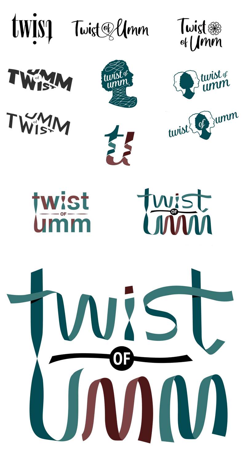
Sometimes it takes time and numerous iterations to get to the desired look, such as for this jewelry maker. Here is a sample of the many variations that led to a final logo design.
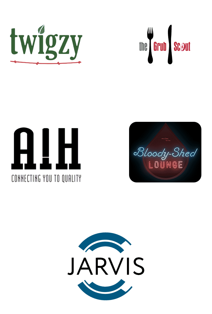
I have designed several logos through the years. Here are a few more samples.
1. Twigzy - Plant Database
2. Grub Hub - Food Blog
3. AIH Fasteners - Industrial hardware manufacturer
4. Bloody Shed Lounge - True crime podcast
5. JARVIS - Internal management platform.